What Font Does YouTube Use?
YouTube Sans is YouTube’s current default font, developed by Google.
It features a sleek and minimalist design that is visually appealing while ensuring optimal readability for users.
It also plays an important role in YouTube’s branding and design.
Why YouTube is so fascinated with YouTube Sans?
Google Designs designed YouTube Sans with the intention of creating a unique visual identity for the company’s growing global presence.
This custom font was also designed to match the typeface with the modernity, innovation, and elegance of the platform, and to effectively appeal to the target audience.
The chosen typeface emanates clarity and simplicity, adding to its visual identity while ensuring a seamless user experience.
It boasts a refined geometric design with well-proportioned spacing, resulting in both functionality and aesthetic allure.
The font’s contemporary, aesthetic design effortlessly integrates with the overall design of the platform’s logo and brand components, creating a cohesive and recognizable brand identity.
In addition to the logo design, the typeface was integrated into various elements of YouTube’s branding, including the user interface and marketing campaigns, to create a consistent visual image.
Importance of typography
Typography is an indispensable component of visual communication.
It plays a critical role in helping to build a sense of professionalism while creating a distinct visual identity for brands and enhancing the user experience.
With the artful implementation of typography, brands attain an unmistakable recognition factor that contributes to their increased recall value.
By carefully selecting a font that aligns with the brand’s core identity and values, companies can shape how their target audience perceives them.
YouTube Sans conveys a sense of innovation and progressive thinking to its vast user base.
By understanding the fonts used by YouTube, we can gain deep insights into the company’s brand strategies and their impact on the overall user experience.
History of fonts used by YouTube
YouTube has an extensive history of experimenting with its fonts and designs to establish and refine its visual identity.
In the early stages, the fonts employed by YouTube reflected its early brand image, aiming to capture the vibrant energy and excitement of user-generated content.
Learn more about the list of fonts used by YouTube here.
However, YouTube Sans, the current font, marked a pivotal milestone in YouTube’s evolution.
As YouTube’s market presence expanded, so did the imperative for change.
In order to make the platform more visually appealing for creators and its users, YouTube evolved and opted for a more professional and polished font.
Currently, YouTube has grown exponentially, from being more inclined towards a youthful spirit to a sophisticated and modern aesthetic and identity.
A notable segment of users appreciates the fresh and contemporary look of the site, interpreting it as a sign of YouTube’s continuous progress.
Nevertheless, some users express signs of resistance towards such changes, as they voice their familiarity with the previous fonts.
Anticipating Future Fonts changes
With the constant evolution of YouTube, there are considerably high chances to consider font changes in the future.
A thoughtfully executed alteration in the font has the potential to breathe new life into YouTube’s innovation.
It can enhance the user experience by integrating more appealing and captivating fonts, thereby distinguishing it from other video streaming platforms.
By incorporating fonts with a more playful demeanor, YouTube can effectively capture the attention of younger audiences on the platform and create a sense of fun and creativity.
However, font changes may lead to confusion and build resistance among both creators and viewers, therefore, it is necessary to execute these changes with careful consideration while taking into account the user reception and feedback to mitigate any potential adverse effects.
Conclusion
The font selection holds a significant impact on establishing a brand’s identity.
As YouTube perpetually expands and adapts to the fast-paced world of digital platforms, its selection of fonts will inevitably continue to evolve, reflecting its commitment to innovation and visionary outlook.
By leveraging the power of typography, YouTube can shape its brand identity, enabling it to resonate with a younger demographic, by staying relevant and updated with contemporary trends.
For more exciting details and the history of YouTube and other social media platforms, such as how the YouTube Awards came about and how you can nominate your channel, subscribe to our newsletter “Influence Weekly” here.
What font does Youtube use? (Answered)
When it comes to overall visual design and art, one key component for an excellent design is the typing font. It is vital as it communicates the desired message to the right audience. This works the same for YouTube. Statistically speaking, YouTube holds one-third of all existing internet traffic. It has more than one billion users across the globe.
It is a platform where almost anyone can create content. Not only that but it is a place where users are able to discover and share likes and interests through a simple video. YouTube, as a company, has grown to be one of the most widely recognized companies in the world.
We can define YouTube as a video-sharing platform. It was founded in America, specifically in San Bruno, California. This service was created by three former PayPal employees. Steve Chen, Jawed Karim, and Chad Hurley were the ones that created this service back in February 2005.
A year later, it was bought by Google for exactly $1.65 billion. Today, YouTube works and operates like one of Google’s many subsidiaries. But, even though it works under google, the design and typeface don’t resemble Google at all. Unlike Google, it comes with a packed personality. The typeface is full of joyful yet sharp letters. YouTube uses a very special font called Youtube Sans.
YouTube Sans
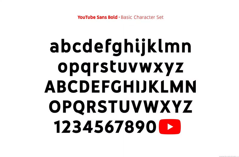
YouTube Sans comes as a display face. It was so deeply incorporated into YouTube that it seemed like it actually belong to it. As Youtube TV was launched in 2017, the second version of this font came out.
This family of fonts composes of light, medium and bold weights. This offers an extended range of uses both inside and outside of the product. This font is ideal as it is specifically designed for reading on smaller screens. It can be read on such screens through cinematic scales.
The new logo consists of the word-mark in black and the play button in pure red. The wordmark is likely custom lettered.
Here are several fonts that are similar to YouTube Sans
Trade Gothic
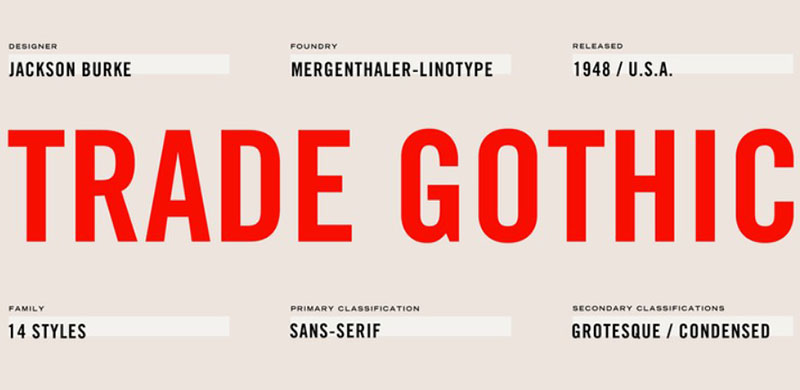
The first font that is similar to YouTube Sans is Trade Gothic. It is a font that was originally designed by Jackson Burke. It was designed in 1948. This designer then further continued to work on other other weights and designs. After the 1960’s, he became the director of type development for Mergenthaler-Linotype, USA.
This type of font style is defined by its use of condensed faces. These faces are excellent for headline uses.
GT America Font
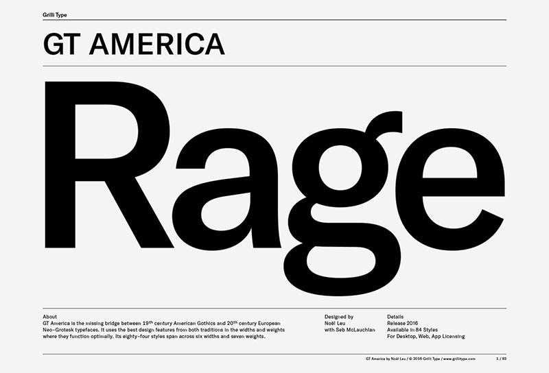
Another font that is like YouTube Sans is GT America. It was formerly known as GT Federal. It is a sans-serif typeface. It was released through Grilli Type back in 2016. Designed by Noel Leu, it was then improved by Seb McLauchan. This is a unique design. It draws inspiration from American and Swiss grotesques. It is an enormous family of fonts that comes in seven weights and five weights. It also comes with a monospased version.
Get 300+ freebies in your inbox!
Subscribe to our newsletter and receive 300+ design resources in your first 5 minutes as a subscriber.
Thank you!
One more step is needed. Please check your inbox for the newsletter confirmation email.
This font has only been used for YouTube titles and videos. That is why they are bold and rendered large. But this font only applies to titles. Other fonts, such as Roboto,are used in forward buttons, and subheads. Other content is written with other fonts as well. Google has chosen Roboto as the official font for both Android and YouTube.
Roboto
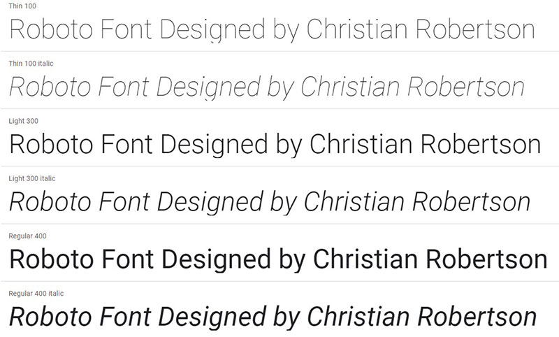
Roboto is the font that is most commonly used in Android devices and applications. This is a font that comes in several weights. This type of font was designed by Christian Robertson in 2011. It is an open-source, sans-serif typeface. Its nature is dual. Roboto has a skeleton that is mechanical and the forms are large and geometric.
Fonts Similar to Roboto
DIN
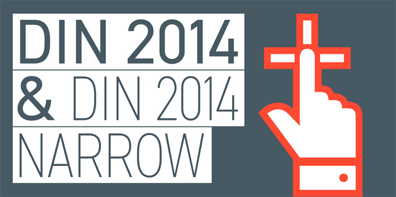
The original version of this font was released first in 1931. It was originally created to be used in technical and engineering applications. This font characterizes with old, primate look that is unrefined.
Akkurat
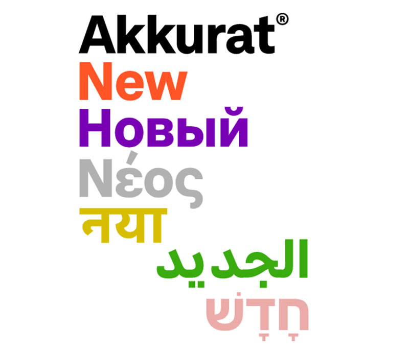
This is a gnarly sans-serif typeface. This typeface was made by Laurez Brunner. He is a designer that has released this font in 2004. After it has been released, it has gotten a lot of critical approval. This is a font that can ba found in three weights.
IBM Plex Sans
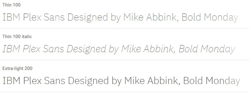
IBM Plex™ is a worldwide typeface family. It was created by Mike Abbink, IBM BX&D, in partnership with Bold Monday. Bold Monday is an independent Dutch type foundry. The result is a neutral, yet friendly Grotesque style typeface. It incorporated a Sans, Sans Condensed, Mono, and Serif and has outstanding legibility in print, web and mobile interfaces. Plex’s three designs work well separately and even better together.
Old YouTube Font: Arial
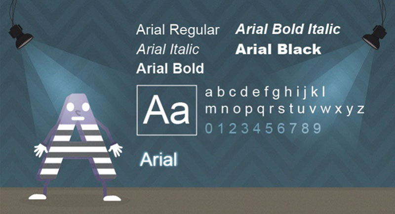
Arial is a modern sans serif typeface. It was originally created by Patricia Saunders and Robin Nicholas. It was designed for Monotype in 1982. It is the most wide known and most used default typeface. Arial is easy to read at both large and small sized. It is used in various applications. This font has been the default for several decades.
But, its use doesn’t end here. This font type has been most commonly used in many forms of advertising as well as office communication and book designs. Because it has many narrow widths, it makes it perfect for all kinds of poster and large print ads.
Similar Fonts to Arial
Helvetica
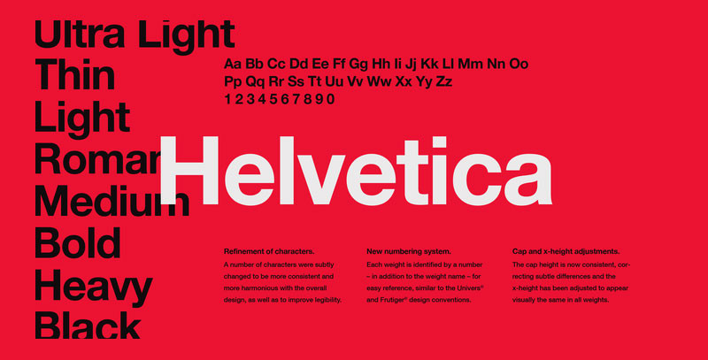
Helvetica is a sans-serif typeface designed by Max Miedinger. It was originally released through the Haas Type Foundry in 1957. The design of Helvetica was influenced by Akzidenz Grotesk. Helvetica is considered the quintessential neo-grotesque typeface.
Neue Haas Unica
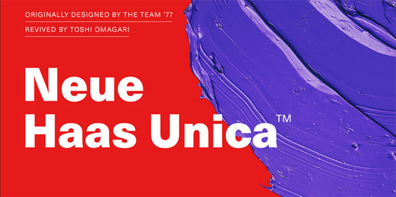
Neue Haas Unica is a font that is quite similar to Helvetica. But, what’s different is that it is slightly looser when it comes to spacing. The letterforms are narrower as well. This is a family of fonts that is comes in nine weights. These are: ultra light, thin, light, regular, medium, bold, heavy, black and extrablack—each with matching italic styles.
Fonts used by Content Creators on Youtube
Fonts are used in almost any thumbnail of a video. They are specifically designed to catch the attention of users and viewers. By using the right font in a way that it is suitably and elegantly placed, content creators convince viewers to click on their video.
They most certainly understand how important it is to use the right font. This is why they use all kinds of ideas, strategies and techniques to get the right result. There are several default fonts. They are offered by Google, of course. Roboto, Roboto Mono, Sans Serif, YT Sans, are just the some examples of the fonts Google provides.
A large number of Youtubers have begun downloading fonts that are custom-designed. They are experimenting with all kinds of fonts to get the maximum results.
About Noto Sans
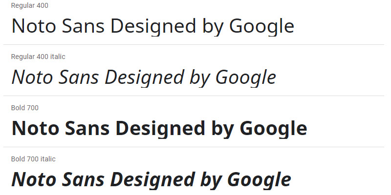
Noto is a great family of fonts. It is a group of fonts that is able to make almost any website even more interesting. For example, when some text is rendered by a computer, not all characters in the text will be displayed. This happens because there is no font that supports them. When this happens, small boxes appear instead of the characters.
Noto, in the moment covers more than thirty scripts. It is possible that it will cover all of Unicode sometime in the future. This includes Sans Greek, Latin and even the Cyrillic family. It also has Bold, Regular and Italic as mentioned before.
If you enjoyed reading this article on what font does Youtube use, you should read these as well:
Как писать таким шрифтом на YouTube (название канала)?
Если вы следите за различными YouTube-каналами, вы, наверняка, заметили, что некоторые авторы используют необычные шрифты при написании заголовков видео и описания. Если вы захотели научиться такому же стилю письма, то в этой статье мы расскажем вам как это сделать.
1. Используйте специальные приложения
Существует множество приложений, которые позволяют вам использовать различные шрифты при написании текста. Вы можете найти их в App Store (для пользователей iPhone) и Google Play (для пользователей Android). Некоторые из них бесплатны, но за некоторые нужно будет заплатить.
Наиболее популярные приложения:
- FancyKey
- Keyboard Plus
- Font Keyboard
2. Используйте генераторы шрифтов
В интернете существует множество сайтов, которые предлагают генерировать текст в различных шрифтах. Вы можете найти такие сайты с помощью поисковика, введя запрос "шрифты для YouTube", "генераторы шрифтов для YouTube" или что-то подобное.
Наиболее популярные сайты:
- Lingojam
- Weirdmaker
- Fontsforweb
3. Используйте символы Unicode
В Unicode существует большое количество символов, которые можно использовать в качестве замены обычному тексту. Вы можете использовать их для создания своего уникального стиля текста на YouTube. Некоторые из них можно найти в таблице символов в вашем компьютере, а другие могут быть найдены с помощью поисковика.
Некоторые из наиболее популярных символов:
- ★
- ♥
- ♪
- ☺
- ☀
4. Используйте HTML-теги
Если вы знакомы с HTML, то вы можете использовать HTML-теги для применения различных стилей к вашему тексту на YouTube. Например, вы можете использовать тег <b> для жирного шрифта или тег <i> для курсивного шрифта. Также можно использовать тег <font> для изменения цвета и размера шрифта.
Наконец, важно помнить, что использование необычных шрифтов не означает, что ваш контент станет более привлекательным. Будьте внимательны и используйте шрифты с умом, чтобы ваш контент выглядел только лучше.
Какой шрифт используется в YouTube?
В рамках продолжающегося сотрудничества YouTube и Saffron создали YouTube Sans – первый шрифт, который бренд может называть своим. Он официально дебютирует в их новейшем продукте – YouTube TV.
Какой выбрать шрифт для логотипа?
Шрифты без засечек имеют лаконичный и современный вид, поэтому данная категория шрифтов часто используется в Интернете. Популярные шрифты без засечек: Arial, Helvetica, Roboto, Proxima Nova, Avenir и Calibri.