Matlab_Graphics
Easy graphics is one of the most famous feature of matlab.
Axis control
Control figure size
legend control
depend on how many lines you plot in a figure;
Legend relative position
Font size
change the fontsize of x,y label at the same time.
Display minor ticks
Linewidth
Display Latex symbols
Use log scale axis[1]
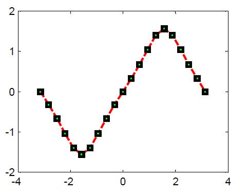
stem plot[2]
stem(x,y) could plot the discrete signals like grass. Its very convenient to display the amplitude of the signal. eg:

fig operation
A figure plotted with matlab can be saved as a .fig figure file. But .fig file actually contains an structure that has objective characters.
Read data from fig file
If the figure is a plot of many subplots, the process to extract its data is even more complicted.
eg. subplot(2,1,:)
If the lines in a subplot are more than one, the basic Children of this figure object shall be more complicated. However, the procedure to extract them shall be the same. eg:
Get fig information
You can check the contents of this fig object via this command: get(fig1)
Save .fig file
plot 2 y axis
yyaxis to replace plotyy
set the parameters of subplot figures
- 2D plot, pcolor
- 2D plot, contourf
Set period function

Annotation for axis[3]
text(x0,y0,‘text’);
This method aims to add comment to the axis object so that is can be used freely in the subplot. While annotation only fit the the figure object, it does not fit to be used in subplot.
Get figure objects
gca: get current axes object
gcf: get current figure object
Add text annotation in fig[4]
set position of subplot and colorbar
You can control the position of every figure via changing the position of the fig objects.

Remove xtick label
Custom colormap
After this kind of setting, you can use this colormap directly via the command: colormap(mymap). Notice the order the colormap is from up to down in the array. You can even use 2D interpolation to make the colormap more dense. 
Appendix: matlab default color names and related RGB values
You can set different colormaps with different colorbars in subplot. This operation only fit to the new version > 2015R. In the new version matlab, you can use set(gca, colormap_n) to control the colormap of each subplot. And the colorbar will automaticly change along with it.
Change the colors of x,y Ticks
Avoid the Axis Tick label overlap
There is no immediate miracles to solve this problem. You can only solve it by adjust the ylim range manually.
Single axis is sub(1), double axes is sub(2).
Control the color, style and boldness of the lines[5]
Control the marker size and colors
Insert array annotation
The above code controls the relative position of the arrow.
Control the length and boldness of the ticks
control the figure boarder[6]
Set colorbar display range
You can set xlim and ylim via caxis([low, high]) manually.
Add transparent block highlight[7][8]
The two parameters in area [x1,x2],[y1,y2] defines the position of color block, while the FaceColor determines the color type, FaceAlpha defines tranparence, Edgecolor defines boarder color。
Add verticle lines
This can be set by the line function, first parameters set x range,second set y range。You can even set the array with plot.
Adjust contour plot colormap range
To get similar color effect. First you need adjust colormap background value. Then you need to adjust the maximum color value.
Colors in MATLAB plots
for more in-depth explanations and fancier coloring, to name just two sources.
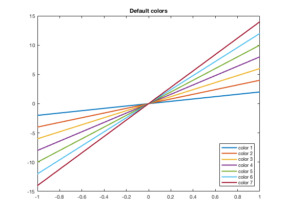
Default Colors in 2D Graphs
The default colors used in MATLAB changed in R2014b version. Here are the colors, in order, and their MATLAB RGB triplet.
| Current color | Old color | ||
|---|---|---|---|
| [0, 0.4470, 0.7410] | [0, 0, 1] | ||
| [0.8500, 0.3250, 0.0980] | [0, 0.5, 0] | ||
| [0.9290, 0.6940, 0.1250] | [1, 0, 0] | ||
| [0.4940, 0.1840, 0.5560] | [0, 0.75, 0.75] | ||
| [0.4660, 0.6740, 0.1880] | [0.75, 0, 0.75] | ||
| [0.3010, 0.7450, 0.9330] | [0.75, 0.75, 0] | ||
| [0.6350, 0.0780, 0.1840] | [0.25, 0.25, 0.25] | ||
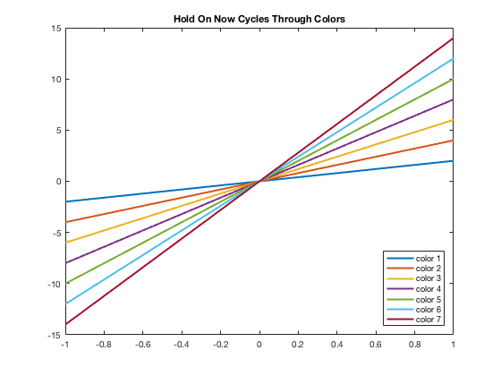
Another thing that changed starting in the R2014b version is that the hold on and hold off automatically cycles through the colors. In the past, each new plot command would start with the first color (blue) and you would have to manually change the color. Now it will automatically move to the next color(s). See below for how to manually adjust the colors.
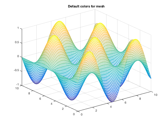
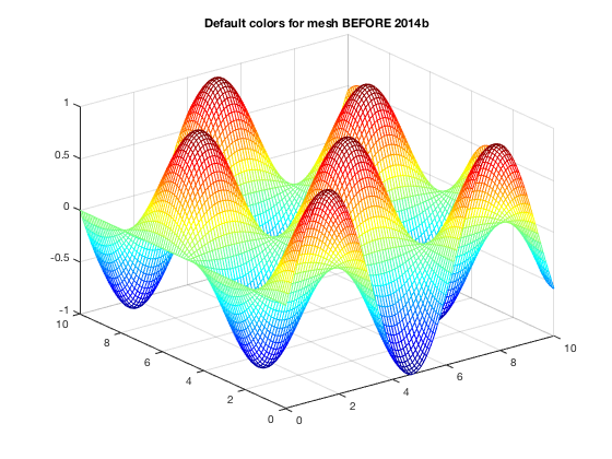
Default Colors in 3D Graphs
If using mesh(x,y,z), to change the look of it you would want to change 'EdgeColor'. Note that the name of this colormap is «parula» while previous to R2014b, it was «jet»
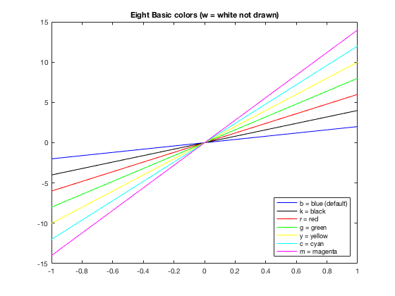
Using Basic Colors in Graphs
The eight basic colors are known by either their short name or long name (RGB triplets are also included).
| Long Name | Short Name | RGB Triplet |
|---|---|---|
| blue | b | [0,0,1] |
| black | k | [0,0,0] |
| red | r | [1,0,0] |
| green | g | [0,1,0] |
| yellow | y | [1,1,0] |
| cyan | c | [0,1,1] |
| magenta | m | [1,0,1] |
| white | w | [1,1,1] |
Example of how to change the color using short names is below. You can easily do the same thing using the long names.
Changing Colors
Many times you want to have more control of what colors are used. For example, I may want some data points drawn in the same color as the curve. Or I have a piece-wise graph that I want to have all the same color. There are several ways to do this. One is to use the default colors and «resetting» the order, which is shown here. Others involve using the RGB triplet (see next section).
As you may see, this could get confusing to keep track of. Thus it may be easier to use the RGB triplets, and even name them ahead of time. This is discussed in the section below.
Using RGB triplets to change colors
One can specify colors using a vector that gives the RGB triple where in MATLAB, each of the three values are numbers from 0 to 1. Usually RGB colors have values from 0 to 255. You can use those numbers and divide the vector by 255 to use within MATLAB. Thus knowing the MATLAB RGB triples for the colors can be useful. From the table above, we can define the default colors to work with them or can put in the RGB triplet (as a vector) directly into the plot command. Both are shown in this example.
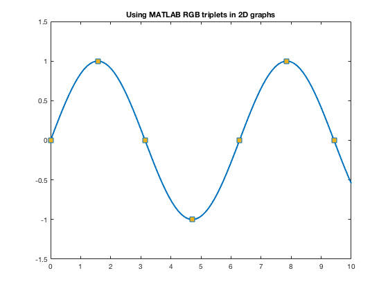
For other colors, you can look up their RGB code on many websites such as RGB Color Codes Chart or HTML Color Picker to see the RGB codes (or hex codes, etc.) For example, at these RGB Color websites, you will be given R=255, G=0, B=0 for red. So you can use 1/255[255,0,0] to get the color of red to use as a color in MATLAB.
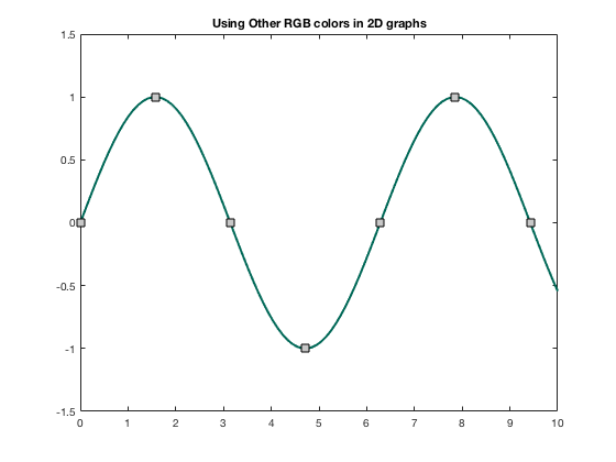
The official color for Loyola Green is given as RGB:0-104-87, and Loyola Gray is given as RGB:200-200-200 (found on Loyola’s Logos/University Signature page. Here’s how one can use those colors in MATLAB.
Now one can use these colors to specify the color of markers, lines, edges, faces, etc.
Changing colors in 3D Graphs
If using mesh(x,y,z), to change the look of it you can change to a different colormap as discussed in https://www.mathworks.com/help/matlab/ref/colormap.html. This was done above when showing the previous default colormap. Here are some more.
Warning! Once you change the colormap, it will keep that colormap for all subsequent 3D plots within the same figure or MATLAB session until you use close, or open a new figure window.
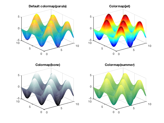
For mesh and surf, you can change 'EdgeColor' and/or 'FaceColor' to be uniform, rather than using colormaps.
Некоторые полезные средства настройки графиков (plot) в MATLAB
Недавно, в очередной раз проверяя домашние работы своих студентов, я загорелся желанием автоматизировать этот процесс. Задание состояло в составлении рабочей таблицы девиации магнитного компаса и построения кривой девиации.
Входными данными служили показания магнитного компаса (МК), синхронно наблюдаемые показания гирокомпаса (ГК), поправка ГК и значение магнитного склонения для района, в котором проходили измерения.
Все данные были занесены в таблицу и разделены из 10 столбцов с входными данными и 25 строк – значений входных данных для каждого из вариантов. Для удобства считывания данных в MATLAB они были записаны в виде текстового файла и импортировались в рабочее пространство с помощью функции importdata.
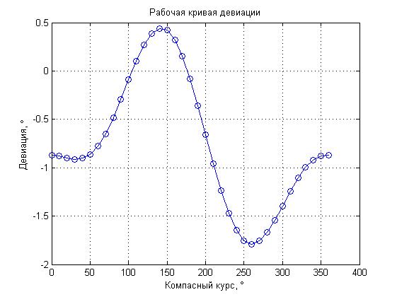
По методике расчетов необходимо было обработать данные с помощью нескольких эмпирических формул для заполнения рабочей таблицы девиации МК. Однако, основным и наиболее наглядным результатом работы является построение кривой девиации МК.
Для построения графика была выбрана функция plot, имеющая большое количество параметров настройки, которые позволяют получить результат в нужном виде. Был составлен код:
И получен следующий график:

Разберем код построчно, рассмотрим какие параметры можно указывать для настройки отображения графиков.
Здесь задаются входные данные для построения графика. Количество значений по оси абсцисс и по оси ординат должно совпадать. По эти данные являются векторами с 36 значениями.
Собственно, функция построения графика, в которую передаются данные и параметры. Помимо очевидных входных данных параметром функции является тип отображаемой линии, закодированный трехсимвольным сочетанием. В данном случае “b” – blue, цвет линии; “o” – вид маркера, которым обозначаются точки графика и “-” – тип линии, в данном случае – сплошная.
Ниже привожу список параметров для настройки отображаемой линии.
Маркер Цвет линии
c голубой
m фиолетовый
y желтый
r красный
g зеленый
b синий
w белый
k черный
Маркер Тип линии
— непрерывная
— — штриховая
: пунктирная
-. штрих-пунктирная
Маркер Тип маркера
. точка
+ знак «плюс»
* знак «звездочка»
о круг
х знак «крест»
Команда, которой включается сетка на графике.
Подписи для графика и соответствующих осей. Здесь “\circ” кодировка символа градуса.
Команда управления осями. В данном случае выставлен параметр “auto” – автоматическая расстановка осей. Здесь-то меня и не устроила работа MATLAB, т.к. автоматически оси не пристыковывались к крайним значениям графика, а «добавляли» лишнее пространство по оси “X”.
С помощью команды “help axis” я нашел еще несколько вариантов параметра для осей, в частности попробовал параметр “tight”, который должен был пристыковывать границы графика к крайним значениям кривой. Однако результат и этого параметра меня не удовлетворил т.к. результат выглядел следующим образом:
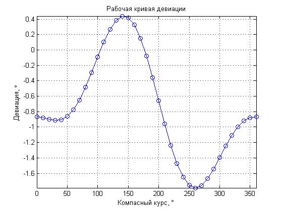
График выглядит «зажатым», к тому же «теряются» части кривой находящиеся между максимальными значениями.
Для получения наглядного результата пришлось настроить ось “X” отдельно с помощью следующих команд:
Последняя функция задает граничные значения отдельно для оси “X”, что позволило мне ограничить график максимальными значениями по данной оси.
И последняя команда:
Позволила настроить подписи и шаг для оси “X”. Функция “set” является достаточно общей, ее работа зависит от передаваемых параметров. В данном случае “gca” – означает, что параметры будут устанавливаться для сетки графика, “ XTick ” – означает, что будет управляться подпись оси “X”, а параметр “0:45:360” – задает минимальное значение, шаг и максимальное значение.
В результате получился достаточно наглядный график кривой девиации, по сравнению формы которого с формой графика полученного студентом можно было быстро оценить правильность выполнения работы. Так же, благодаря загрузке данных из файла по всем вариантам, с дальнейшим выбором последнего, изменять приходилось только номер варианта, чтобы получить результат.
Надеюсь, что эта статья будет полезной не только для начинающих MATLAB, но и для опытных пользователей.
В окончании хотел бы отметить полезность команды “help” – она не только позволяет получить необходимую информацию по функции или команде из командной строки, но и сделать это значительно быстрее, чем через поиск в справке MATLAB.
Matlab Plot Colors and Styles
As we have already stated here, by writing help plot or doc plot in Matlab you will be able to find the information we are about to give you down below.
Matlab plotting colors
The following are the letters you can add to your code to control the color of your plot while plotting in Matlab.
- b blue
- g green
- r red
- c cyan
- m magenta
- y yellow
- k black
- w white
Let’s try some variants on the following example.
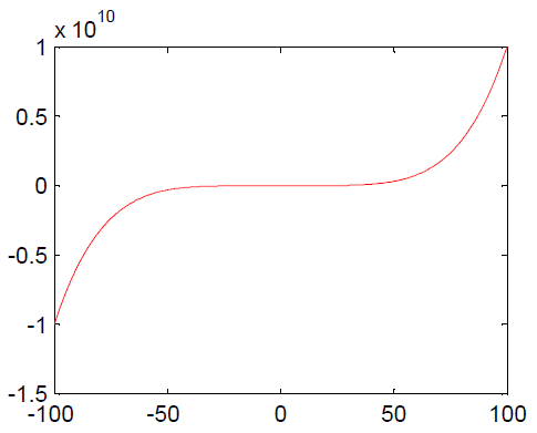
The default code to plot is:
And the following will is the corresponding plot
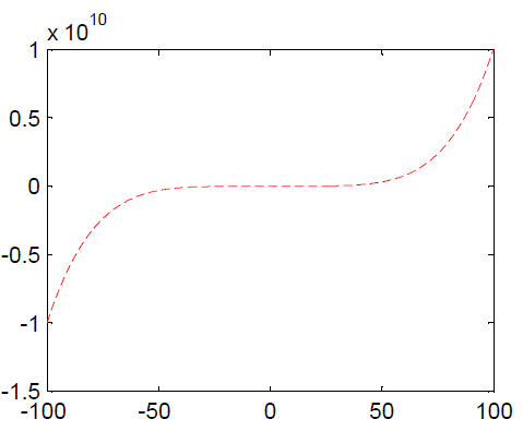
Let’s twist the code a little to change the plot color
For the following code
The plot will look like
You must surely have grasped how to add the color code to get your graph to the wanted color, and notice at the beginning of this post the different color and code you can make use of while using this technique
Matlab plotting line style
Just like it is to change the color of your plot in Matlab, the same goes for changing the line style, increasing the thickness of the line or some other aspect of it
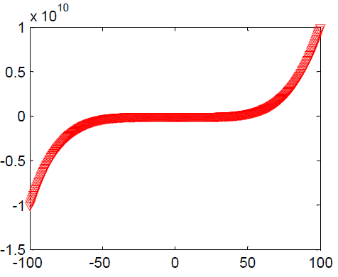
Let’s go ahead a plot the following code
And the plot will be
and the plot will be
Here is the code you can use to change the line style. (You can get that information with help plot)
. point
o circle
x x-mark
+ plus
* star
s square
d diamond
v triangle (down)
^ triangle (up)
< triangle (left)
> triangle (right)
p pentagram
h hexagram
— dashed
-. dashdot
: dotted
– solid
Here is how to change the thickness of the line of your plot in Matlab
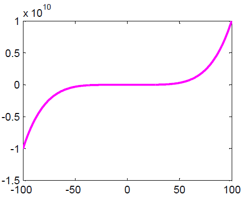
Here is another example which you can learn a lot from
Plotting multiple graphs on the same plot
One of the many ways to plot multiple functions on the same plot is to use hold on or insert the corresponding equations in the plot code.
Here is a simple example
This can also be done the following way
Matlab subplot
Subplot helps have plots side by side on the same sheet. Here is what Matlab says about it. (Use Help Subplot)
subplot Create axes in tiled positions.
H = subplot(m,n,p), or subplot(mnp), breaks the Figure window into an m-by-n matrix of small axes, selects the p-th axes for the current plot, and returns the axes handle. The axes are counted along the top row of the Figure window, then the second row, etc. For example,subplot(2,1,1), PLOT(income)
subplot(2,1,2), PLOT(outgo)