Что такое кернинг в ворде
Интервалы между знаками можно изменять как для выбранного текста, так и для отдельных знаков. Кроме того, вы можете растянуть или сжать текст целого абзаца для придания ему желаемого вида.
Изменение интервала между знаками
При выборе параметра Разреженный или Уплотненный между всеми буквами устанавливаются одинаковые интервалы. Кернинг регулирует интервалы между отдельными парами букв, уменьшая или увеличивая их.
Равномерное увеличение или уменьшение интервалов между всеми выделенными знаками
Выделите текст, который требуется изменить.
На вкладке Главная щелкните средство запуска диалогового окна Шрифт  (на снимке экрана ниже) зеленым цветом, а затем перейдите на вкладку Дополнительно .
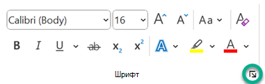
В поле Интервал выберите параметр Разреженный или Уплотненный, а затем введите нужное значение в поле на.
Кернинг знаков, размер которых превышает заданный
Кернингом называется регулировка расстояния между двумя знаками. Идея заключается в том, чтобы дать лучший результат, уменьшив интервал между символами, которые хорошо вписываются вместе (например, «A» и «V») и увеличить интервал между символами, которые этого не делать.
Выделите текст, цвет которого требуется изменить.
На вкладке Главная щелкните средство запуска диалогового окна Шрифт (на снимке экрана ниже) зеленым цветом, а затем перейдите на вкладку Дополнительно .
Установите флажок Кернинг для знаков размером, а затем введите нужный размер в поле пунктов и более.
Изменение масштаба текста по горизонтали
При изменении масштаба форма знаков меняется в соответствии с указанным процентным значением. Масштаб текста изменяется путем его сжатия или растяжения.
Выделите текст, который вы хотите сжать или растянуть.
На вкладке Главная щелкните средство запуска диалогового окна Шрифт (на снимке экрана ниже) зеленым цветом, а затем перейдите на вкладку Дополнительно .
Введите нужное процентное значение в поле Масштаб.
Проценты свыше 100 процентов растягивают текст. Процент ниже 100 процентов сжимает текст.
Изменение междустрочных интервалов
Чтобы увеличить или уменьшить объем вертикального пространства между строками текста в абзаце, лучше всего изменить стиль абзаца.
Найдите стиль, который вы используете, в коллекции Стили на вкладке Главная .
Щелкните стиль правой кнопкой мыши и выберите пункт Изменить.
В центре диалогового окна находятся кнопки междустрочного интервала, позволяющие выбрать одинарный, 1,5 или двойной интервал. Выберите интервал, который вы хотите применить, и нажмите кнопку ОК.
Если вы хотите применить к стилю более конкретный междустрочный интервал, нажмите кнопку Формат в левом нижнем углу диалогового окна Изменение стиля и выберите Пункт. Раскрывающийся список Междустрочный интервал позволяет выбрать или задать более конкретный междустрочный интервал.
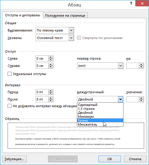
Дополнительные сведения об изменении стилей в Word см. в статье Настройка стилей в Word.
Как включить Кернинг в Word 2013 Документы — манекены
В Word 2013 есть много возможностей, которые вы можете использовать, чтобы сделать ваши документы визуально привлекательными и профессиональными. Одна из этих функций называется кернинг. Кернинг — это интервал между двумя буквами, основанный на том, как они формируются.
Кернинг уменьшает пространство между определенными парами букв на основе их форм. Кернинг может сделать визуальное различие, когда две большие буквы смежны друг с другом, и их формы совпадают, например, V и А. Кернинг помещают их ближе друг к другу, чем они обычно были бы, поэтому это не выглядит Слишком много пространства между ними.
Кернинг обычно выполняется только тогда, когда текст превышает определенный размер точки, потому что при меньших размерах это не заметно. Теперь вы можете посмотреть примеры ядра и не связанного текста в Times New Roman со 100 точками.

В документе Word 2013 трижды щелкните заголовок, который у вас есть в верхней части страницы, чтобы выбрать его.
В этом примере используется текстовая проводка.
На вкладке «Главная» щелкните панель запуска диалогового окна в группе «Шрифт».
Откроется диалоговое окно «Шрифт».
На вкладке «Дополнительно» щелкните «Кернинг для шрифтов определенных точек», в этом примере выберите «18» и «Выше», но оставьте значение по умолчанию в 18 пунктов как есть. Нажмите «ОК».

Выбранный текст сгенерирован. Разница тонкая, поэтому вы можете даже не заметить изменения.
Уменьшение расстояния между буквами в документе Word

Сделать меньшим расстояние между буквами, как и любыми другими символами, в текстовом документе Ворд можно путем изменения определенных параметров шрифта. Для этого:
- Выделите фрагмент текста, интервал между знаками в котором требуется уменьшить.
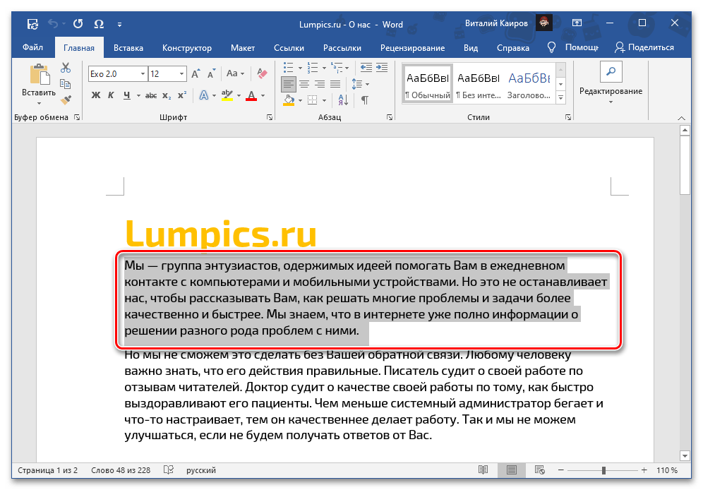
- Вызовите параметры группы инструментов «Шрифт», кликнув по обозначенному на изображении ниже значку или нажав на клавиши «Ctrl+D».
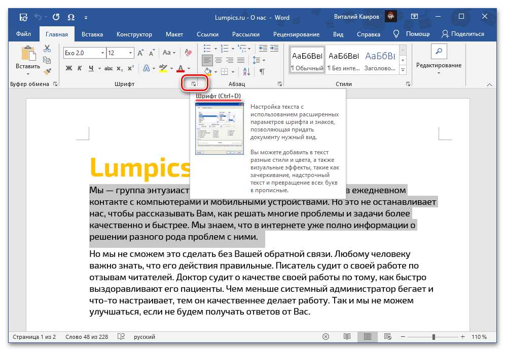
Примечание: Вместо шаблонного значения межзнакового интервала можно задать произвольное – для этого следует указать желаемое количество пунктов в расположенном справа поле «на».
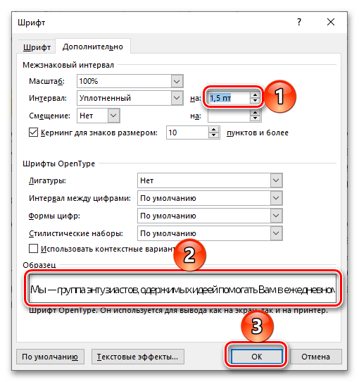
Таким образом выполняется равномерное уменьшение расстояния между содержащимися в любом фрагменте текста буквами, однако иногда его требуется отрегулировать более тонко. Для этого следует изменить кернинг, то есть уменьшить отступ между теми парами знаков, которые визуально «подходят» друг другу (к примеру, буквы «A» и «V»), и увеличить его между теми, что не умещаются.
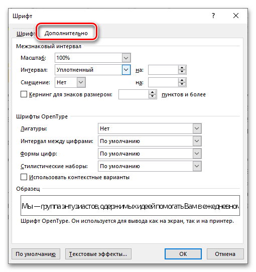
- Повторите действия из первых двух шагов представленной выше инструкции. В открывшемся окне «Шрифт» так же, как и в предыдущем случае, перейдите на вкладку «Дополнительно».
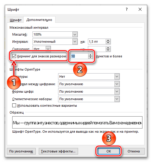
- Установите отметку в чекбоксе «Кернинг для знаков размером», а в расположенное праве поле «пунктов и более» введите желаемое значение.
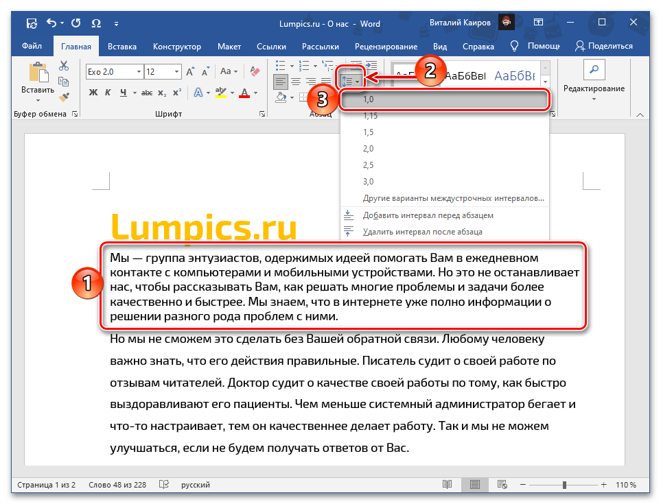
Если поставленная перед вами задача заключается не только в изменении так называемого горизонтального расстояния между символами (собственно, межзнакового интервала), но и в его вертикальной регулировке, то есть между строк, ознакомьтесь с другой инструкцией на нашем сайте, ссылка на которую дана ниже.
По необходимости, как в дополнение к межсимвольному интервалу, так и независимо от него, можно уменьшить размер стандартных пробелов, сделав их короткими или четвертными, либо, если изначально они слишком большие, исправив на стандартные. Обо всем этом мы тоже ранее рассказывали в отдельных статьях.
Free What Is Font Kerning In Word In Graphic Design

Characters being kerned are referred to as a kern pair, and the amount of kerning can have either a negative or a positive value. In later versions of word make sure the advanced tab is selected.
Free What Is Font Kerning In Word In Graphic Design, In later versions of word make sure the advanced tab is selected. You can experiment with logos and headlines and see how different letters work together reasonably easily.

How To Kerning Word Doc lasopahit From lasopahit358.weebly.com
Kern type , an online kerning game for practising letter spacing, is great for getting instant feedback. You have a word with the first and last letters locked in place. Check the box for kerning for fonts under character spacing. Word displays the font dialog box.
How To Kerning Word Doc lasopahit But it is also the act of adjusting the space between characters to make text look better, more eligible, or both.
To change kerning automatically, perform the following steps: It is applied to the letters of the word of any sentence. Unlike tracking, which adjusts the amount of space between the letters of an entire word in equal increments, kerning is focused on how type looks — creating readable text that’s visually pleasing. If the kerning is too tight, letters will touch or overlap (like the image here… whoa!).

Source: github.com
Within the advanced tab, select the checkbox for kerning for fonts. At this point, you can now adjust your kerning using the upward and downward facing arrows to. If playback doesn’t begin shortly, try restarting your device. Next, check the box next to “kerning for fonts” and then input the font size in the text box to the right that you’d like to apply the rule to. How to get Kerning to work with Font on Windows · Issue 3272.

Source: pinterest.com
And the font kerning setting on the character spacing tab still applies. Wordart in 2010 is still the same as in 2007. If your writing copy in microsoft word, or using word to design a poster, you might want to use kerning, especially if your font is bigger and the letters look awkward. Unfortunately, word 2007 is just one version too early to do what you want. Turn on kerning in Word Tecnicas de creatividad, Creatividad.

Source: thomasphinney.com
Next, check the box next to “kerning for fonts” and then input the font size in the text box to the right that you’d like to apply the rule to. In word 2007 make sure the character spacing tab is selected. This method of kerning uses an algorithm to calculate the most optimal spacing between the letters. Fortunately, it’s easy to do. Phinney on Fonts » On Kerning (and Spacing) Fonts.
 Source: blog.hubspot.com
Essentially, kerning is about adding visual consistency to letter spacing. If playback doesn’t begin shortly, try restarting your device. Word displays the font dialog box. This method of kerning uses an algorithm to calculate the most optimal spacing between the letters. A Comprehensive Guide to Kerning in Typography.

Source: simuldocs.com
It’s the name given to the spacing between characters. To turn on kerning, here are the steps: Within the advanced tab, select the checkbox for kerning for fonts. If the text has already been typed, highlight the text (use select all at the right of the home tab if you wish to highlight the entire document). How to change fontkerning in Microsoft Word Simul Docs.

Source: pinterest.com
To turn on kerning, here are the steps: Select the text whose kerning you want to adjust. Go to ‘advanced.’ tick the ‘kerning for fonts’ box. And the font kerning setting on the character spacing tab still applies. Fixing Kerning in Word Words, Kerning, Typography fonts.

Source: graficnotes.blogspot.com
Optical kerning is an advanced feature that automatically detects the outline of each letter. You need to turn it on manually in order for the kerning to be applied. Click the funny icon in the bottom right corner of the font group on the home tab (this is illustrated below). Unfortunately, word 2007 is just one version too early to do what you want. Kerning.
Source: pinterest.com
There are several terms or techniques that are taken into consideration by every designer in making his work, such as kerning , leading. You can experiment with logos and headlines and see how different letters work together reasonably easily. Kerning is the spacing between individual letters or characters. Activedocument.content.font.kerning = 12 this example displays the minimum font size for which word will automatically adjust kerning in the selected text. kerning7 Kerning poster, Word design, Types of lettering.

Source: simuldocs.com
Similarly, kerning is one of the properties of css text. That’s why you can’t specify the amount of kerning that word does when it’s turned on. Click the funny icon in the bottom right corner of the font group on the home tab (this is illustrated below). To change kerning automatically, perform the following steps: How to change fontkerning in Microsoft Word Simul Docs.

Source: fontbundles.net
This example sets the minimum font size for automatic kerning to 12 points or larger in the active document. Essentially, kerning is about adding visual consistency to letter spacing. Kerning defines both a process and a term. Open that word document and highlight the text you want to adjust the kerning for by clicking and dragging the cursor over the text. Creating a Font from Scratch The Font Bundles Blog.

Source: kimberlygeswein.com
Kern type , an online kerning game for practising letter spacing, is great for getting instant feedback. There are several terms or techniques that are taken into consideration by every designer in making his work, such as kerning , leading. You have a word with the first and last letters locked in place. But it is also the act of adjusting the space between characters to make text look better, more eligible, or both. Tip Using Kerning in Word « Kimberly Geswein Fonts.

Source: simuldocs.com
That’s why you can’t specify the amount of kerning that word does when it’s turned on. Select the text whose kerning you want to adjust. To the right, enter the minimum point value. Choose the tools option from the font menu. How to change fontkerning in Microsoft Word Simul Docs.

Source: simuldocs.com
Kerning defines both a process and a term. If the kerning is too tight, letters will touch or overlap (like the image here… whoa!). Go to ‘advanced.’ tick the ‘kerning for fonts’ box. Essential science for font designers. How to change fontkerning in Microsoft Word Simul Docs.

Source: gcflearnfree.org
While typeface designers build in spaces around each letter, and sometimes. In word 2007 make sure the character spacing tab is selected. And if it’s too loose, you’ll end up with awkward gaps between your. Expression an expression that returns a font object. Beginning Graphic Design Typography Page 1.

Source: simuldocs.com
Here is how to apply kerning in microsoft word 2007 and up: To the right, enter the minimum point value. In the font dialogue box, under the character spacing tab, there is the optiion for kerning, and the option for spacing. Click the funny icon in the bottom right corner of the font group on the home tab (this is illustrated below). How to change fontkerning in Microsoft Word Simul Docs.
 Source: blog.hubspot.com
This example sets the minimum font size for automatic kerning to 12 points or larger in the active document. Word displays the font dialog box. Within a word document, go. In word 2007 make sure the character spacing tab is selected. A Comprehensive Guide to Kerning in Typography.
Source: lasopahit358.weebly.com
It is applied to the letters of the word of any sentence. Kerning in ms word kerning is turned off by default in microsoft word. This method of kerning uses an algorithm to calculate the most optimal spacing between the letters. Open that word document and highlight the text you want to adjust the kerning for by clicking and dragging the cursor over the text. How To Kerning Word Doc lasopahit.
When you do this, a font dialog box will appear. If playback doesn’t begin shortly, try restarting your device. The kerning seems to be bad, and with cleartype turned on the lettering looks indistinct. Within a word document, go. Kerning in Microsoft Word by VictoriaTheTech Teacher Tech.

Source: simuldocs.com
Font kerning is about manually fiddling with the space between letters when the default kerning of a font is not ideal for a specific combination of letters causing text to look off somehow. If playback doesn’t begin shortly, try restarting your device. Large blocks of small type generally don’t need as much kerning. The value of the kerning can be a positive sign or a negative sign. How to change fontkerning in Microsoft Word Simul Docs.

Source: webdesignledger.com
And the font kerning setting on the character spacing tab still applies. Kerning is visually more important at large font sizes such as in headings, which is why word lets you turn on. Choose the tools option from the font menu. Go to ‘advanced.’ tick the ‘kerning for fonts’ box. Everything You Need To Know About Kerning 2020 Update Web Design Ledger.

Source: diynations.com
Kerning in ms word kerning is turned off by default in microsoft word. Next, on the home tab, click the little expand icon in the lower right corner of the font group to launch the font dialog box, or just press ctrl + d (command + d on mac). Enable and adjust kerning in word on windows open the font dialog box by clicking the arrow on the bottom right corner of the font section of the ribbon. This method of kerning uses an algorithm to calculate the most optimal spacing between the letters. Cricut Kerning Fonts Everything You Need to Know DIY Nations.

Source: thomasphinney.com
In the world of graphic design, many factors are important to produce a good visual design. Expression an expression that returns a font object. When you do this, a font dialog box will appear. Many quality fonts come with hundreds of thousands of “kern pairs” included. Phinney on Fonts » On Kerning (and Spacing) Fonts.

Source: indesignskills.com
In word 2007 make sure the character spacing tab is selected. Enable and adjust kerning in word on windows open the font dialog box by clicking the arrow on the bottom right corner of the font section of the ribbon. Check the box for kerning for fonts under character spacing. In word 2010 or 2013 there is a text effects button in the font dialog for regular text, in which you can choose the weight and color for the outline; Kerning A Quick Guide to Kerning Like a Pro Designer.

Source: groovypost.com
To change kerning automatically, perform the following steps: Enable and adjust kerning in word on windows open the font dialog box by clicking the arrow on the bottom right corner of the font section of the ribbon. Next, check the box next to “kerning for fonts” and then input the font size in the text box to the right that you’d like to apply the rule to. Then, go to the advanced tab. How to Enable and Adjust Kerning for Fonts in Microsoft Word.

Source: weston-tech.com
And if it’s too loose, you’ll end up with awkward gaps between your. This method of kerning uses an algorithm to calculate the most optimal spacing between the letters. Kerning is an attempt to spatially interchange one letter with another. Then, go to the advanced tab. Adjust Kerning (Letter Spacing) in Word Weston Technology Solutions.
Select The Text Whose Kerning You Want To Adjust.
Select the text whose kerning you want to adjust. Next, check the box next to “kerning for fonts” and then input the font size in the text box to the right that you’d like to apply the rule to. Characters being kerned are referred to as a kern pair, and the amount of kerning can have either a negative or a positive value. You have a word with the first and last letters locked in place.
The Kerning Seems To Be Bad, And With Cleartype Turned On The Lettering Looks Indistinct.
The character spacing tab of the font dialog box. Go to ‘advanced.’ tick the ‘kerning for fonts’ box. Open that word document and highlight the text you want to adjust the kerning for by clicking and dragging the cursor over the text. In later versions of word make sure the advanced tab is selected.
This Example Sets The Minimum Font Size For Automatic Kerning To 12 Points Or Larger In The Active Document.
The value of the kerning can be a positive sign or a negative sign. Optical kerning is an advanced feature that automatically detects the outline of each letter. If the text has already been typed, highlight the text (use select all at the right of the home tab if you wish to highlight the entire document). Unfortunately, word 2007 is just one version too early to do what you want.
Essentially, Kerning Is About Adding Visual Consistency To Letter Spacing.
Kerning is an attempt to spatially interchange one letter with another. At this point, you can now adjust your kerning using the upward and downward facing arrows to. Launch the “font dialog box” (ctrl+d on windows or cmd+d on mac) and, in the “advance” tab, adjust the “spacing” settings by clicking the up and down arrow next to the “by” box. I used word under windows for.