Редактирование текста
Чтобы выбрать текстовый слой, выполните одно из следующих действий.
- Выберите инструмент «Перемещение» и дважды щелкните текстовый слой на холсте.
- Выберите инструмент «Горизонтальный текст» или «Вертикальный текст» . Выберите текстовый слой на панели «Слои» или щелкните текст на изображении для автоматического выбора текстового слоя.
- Выбрав любой инструмент, дважды щелкните миниатюру типового слоя (значок T) на панели «Слои».
Щелкните, чтобы установить курсор вставки.
Выделите один или несколько символов, которые необходимо редактировать.
Выполните одно из следующих действий, чтобы применить изменения к текстовому слою:
- Выберите новый инструмент.
- Щелкните слой на панели «Слои». (Это действие автоматически применяет изменения и выбирает слой.)
- Нажмите кнопку «Применить» на панели параметров.
- Нажмите клавишу «Esc». Обратите внимание, что клавиша Esc по умолчанию настроена на фиксацию текста. Вы можете изменить это, чтобы отменить изменения, выбрав Правка > Установки > Тип (Windows) или Photoshop > Установки > Тип (MacOS) . Затем снимите флажок Использовать клавишу Esc для фиксации текста.
- Щелкните место на холсте вдали от редактируемого текстового слоя. Следите, как курсор превращается в обычную стрелку указателя, затем щелкните.
Примечание: Если фокус перемещается на другие приложения, ваши изменения фиксируются автоматически.
Чтобы отменить изменения, нажмите кнопку «Отмена» на панели параметров или нажмите клавишу Esc, если вы изменили настройку по умолчанию для функции клавиши Esc в разделе Настройки > Тип > Использовать клавишу Esc для фиксации текста.
Указание фигурных или прямых кавычек
Типографские кавычки, часто называемые фигурными кавычками или просто кавычками, сочетаются с изогнутыми линиями шрифта. Они традиционно используются для обозначения цитат и в качестве апострофов. Прямые кавычки обычно используются в качестве сокращенных обозначений футов и дюймов.
Применение сглаживания к текстовому слою
Сглаживание позволяет получить символы текста с гладкой кромкой, реализуя частичное заполнение краевых пикселов. В результате этого края текста смешиваются с фоном.

При подготовке текста, который будет отображаться на веб-странице, следует учесть, что сглаживание значительно увеличивает количество цветов в исходном изображении. Это ограничивает вашу способность уменьшать количество цветов в изображении и тем самым уменьшать размер файла изображения. Сглаживание может также вызвать появление на краях символов текста случайных цветов. Когда важно снизить размер файла и ограничить количество цветов, может оказаться предпочтительнее отказаться от сглаживания, несмотря на то, что в изображении останутся зубчатые края. Кроме того, следует рассмотреть возможность использования шрифта большего размера, чем при выводе на печать. Шрифт большого размера в веб-изображениях легче читается и позволяет лучше решить, следует ли применять сглаживание.
При использовании сглаживания при малых размерах и низкой разрешающей способности (например, в веб-изображениях) текст может показаться неразборчивым. Чтобы повысить разборчивость, сбросьте флажок «Дробная ширина» в меню панели «Символ».
How To Make Bold And Italic Text In Photoshop

With many text style options, adding bold text in Photoshop is pretty easy, but for unsupported font types, you may need to know other methods to create bold text in Photoshop.
As well as bold text options, you’ll also learn how you can apply an italic effect to your text in Photoshop too. You may think you know the obvious ways to add text effects in Photoshop, but sometimes using unsupported fonts can throw you a curveball, and you need to know some workarounds.
Luckily, once you’ve finished reading this post, you’ll know all the ways to create both bold and italic text using Photoshop.
How To Bold Text In Photoshop
To create bold text in Photoshop, select your text layer in the Layers Panel, then access the Character Panel by going to Window > Character. Now click the Faux Bold icon to bold the text, even if there isn’t a bold font style available in your selected font.
Let’s break that down more in-depth, along with another way of doing this.
To create bold text, you first need to write some text. To do this, select the Type Tool (T).
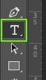
Then either click somewhere on your canvas and start typing or you can click and drag out a text box to fill the space you want the text in.

After you’ve written your text, you may want to change the font and size. To do this, highlight the text by clicking and dragging your cursor over the text.

In the Upper Settings Bar, you can choose a font and set the size. Once you’re happy with the words, font, and size, you can move on to making your text bold.

Because not all fonts are created equally, you may not always be able to bold your text in the Upper Settings bar. That’s because, in some cases, there is no bold font style available.
In that case, you can use options found in the Character panel or layer styles settings to replicate the bold effect if a font style doesn’t support it. It’s always good to have a choice and know how to access multiple methods before you need them.
Let’s first break down how to bold the text by changing the font style.
Option 1: Bold Text Using The Upper Settings Bar
Using the Type Tool (T), highlight the text you want to be in bold. That way, you can make a select word or phrase bold, or the entire text.
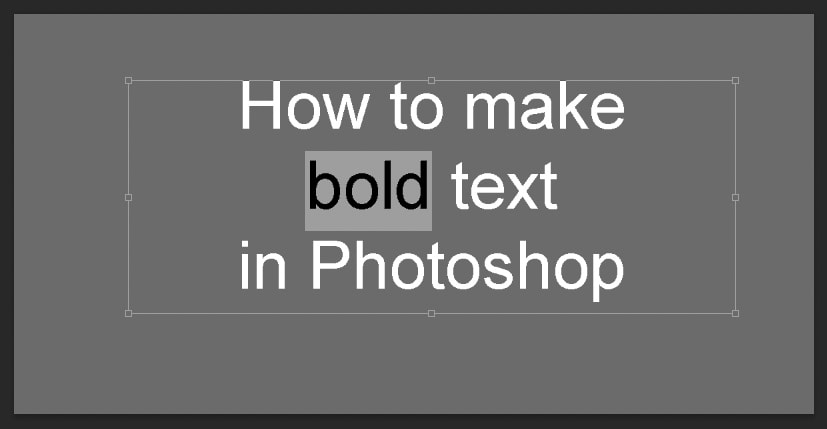
In the Upper Settings Bar, you’ll see a dropdown menu between the text font and size menus. If you’re using a standard font, this dropdown menu should say Regular. If you don’t see an option in this menu, it may mean you can’t bold your font using this method.

Click to open the dropdown menu and reveal the options for different font styles. Choose Bold.
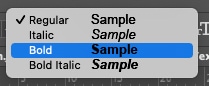
This will change your highlighted text to bold, leaving anything not highlighted in its previous state.
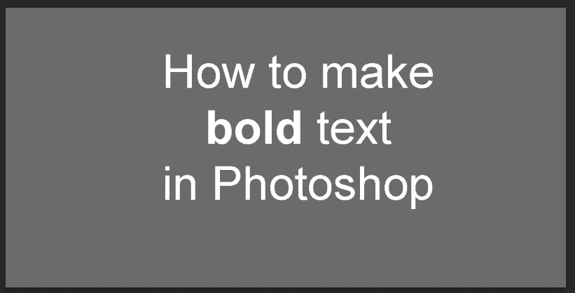
This is the simplest way to make your text bold; however, there are some fonts that do not support this option. Luckily, there are other techniques you can use.
Option 2: Bold Text Using The Character Panel
The Character panel is another menu for text refinements. Although it offers the same method for creating bold as the Upper Settings Bar, it also offers more detailed options like kerning, line spacing, and ligatures, to name a few. It also offers another option to bold text if there is no bold font style available.
To access the Character panel, go to Window > Character.
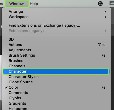
You can hide or show the Character panel by pressing the Character button at any point.

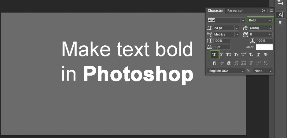
The bold option on the Character panel can be found in two ways. It allows you to add bold text when it may not always be supported with your font type. This method is called Faux Bold.
Using the previous methods, write your text using the Type Tool (T) and then highlight any word or phrase you want to bold.

In the Character panel, you’ll see a row of T icons. The first one is the Faux Bold option. Click Faux Bold to make your highlighted text bold.
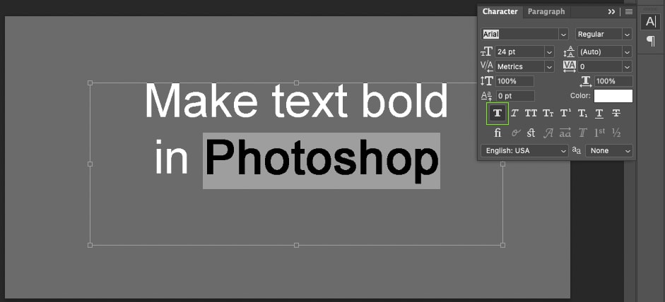
As earlier mentioned, there are two ways to access the Faux Bold from the Character panel. For the other method, click the Menu button on the Character panel and choose Faux Bold.
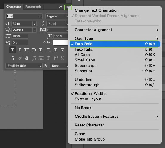
The Faux Bold effect creates the same bold style as the Upper Settings Bar bold option.
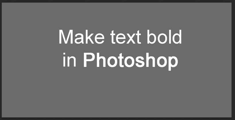
Faux Bold will stay on until it’s manually disabled, even if you start a new project. This means you can actually use the Faux Bold setting in conjunction with the normal bold setting. This combines both to a super bold result.
Option 3: Bold Text By Adding A Stroke Effect
This final technique can offer more dramatic bold effects if needed. Unfortunately, this effect can only be applied to the entire text layer, and not individual words or phrases.
Using a stroke effect to make your text bold is the best way to make bold text when you’re using an unsupported font type or if you want a very heavily bolded text that the standard methods don’t offer.
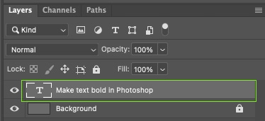
When you write using the Type Tool, your text becomes its own layer in the Layers panel. Click on your text layer to select it.
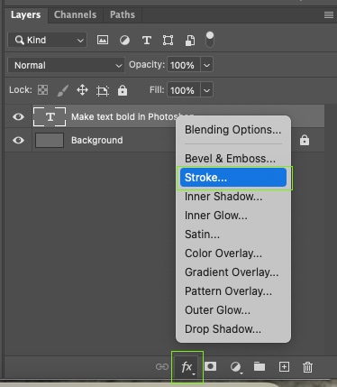
Then at the bottom of the Layers panel, click Effects > Stroke. This opens a Layer style menu where you can add non-destructive style effects to your layers.
In the Layer Style window, choose the same color as your text, set the Opacity to 100%, and set the position to Outside. These settings will best replicate bold text.
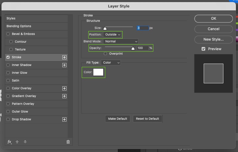
This technique allows you to create a wider stroke size around your letters than you’d find using traditional methods for bold text. To increase the stroke, thus the boldness, change the stroke size using the Size slider in the Layer Style menu.
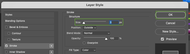
As you change the slider, you can preview your text on the Canvas to ensure it is still legible. Your original canvas will be viewable to the side of the Layer Style menu, so you can visualize the changes. When you’re happy with the bold effect, click OK in the Layer Style menu.
In the Layers panel, you’ll see the non-destructive layer style you’ve applied appear under your text layer. You can switch it off by clicking the eye icon if you no longer want to see it.
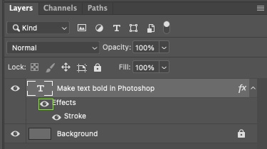
Since this technique only works on an entire text layer, it may not always be appropriate to use for bold emphasis as it can’t bold only specific words.
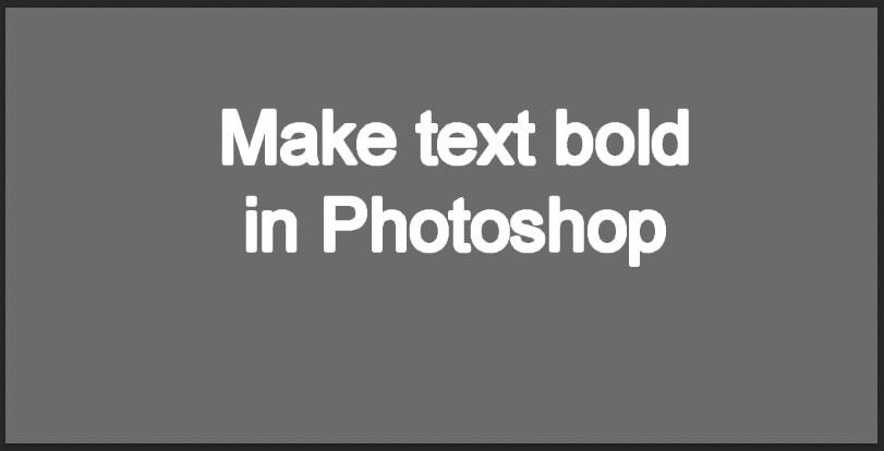
However, you could use individual layers of text to ensure you’re only affecting the words you want to bold.
How To Make Italic Text In Photoshop
Creating bold text is great for emphasis on a particular word or phrase, but when you want to emphasize tone, using italics is much more effective. As the different options for bold text, Photoshop also offers at least two options for making your text italic. You can create italic text in the Upper Settings bar or by using the Character panel.
Option 1: Via The Upper Settings Bar
The simplest way to get italic text in Photoshop is to use the Upper Settings bar. The Upper Settings Bar will appear when the Type Tool is active.
To start, you need to write some text by selecting the Type Tool (T) and clicking on your canvas to begin typing.
With your text typed, format it with line breaks and position it on your canvas if needed.

Set your chosen font and size in the Upper Settings Bar using the dropdown menus. You can also use the Character panel for these options if you have it open.
Once you’re happy with your text, decide which word or phrase you want to be in italics. Then use your cursor to click and drag over those words to highlight them.

Now go to the Upper Settings Bar or the Character panel and click the dropdown menu that says Regular.
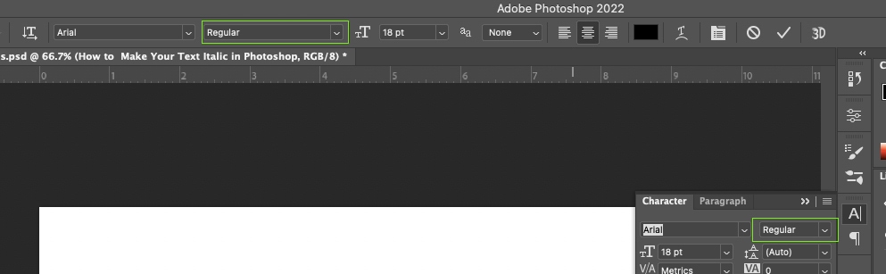
From the dropdown options, choose Italic. This will change your highlighted text to italics.
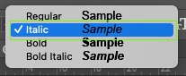
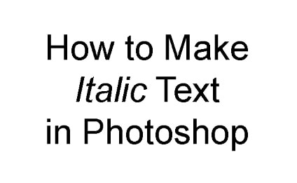
Option 2: With The Character Panel
There is another way to get italic text in Photoshop if you’re using an unsupported font type. It uses the Character panel rather than the Upper Settings Bar.
I’ve mentioned the Character panel throughout a few of the previous steps, but as a reminder, to get the Character panel go to Window > Character.
Now, just like before, type out your text, and then highlight the word or phrase you wish to be in italics.
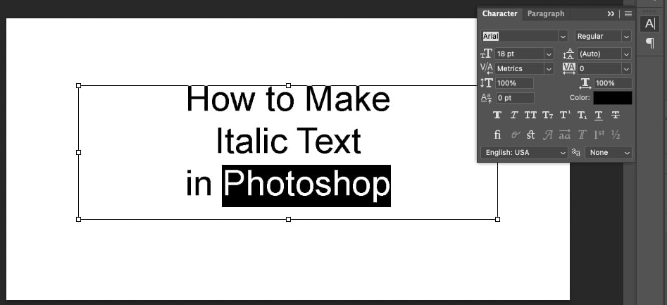
After highlighting your phrase, open the Character panel and click the Faux Italic icon.
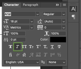
You can also find this method by going to the Character panel’s menu and choosing Faux Italic.
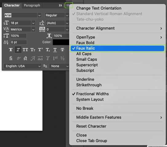
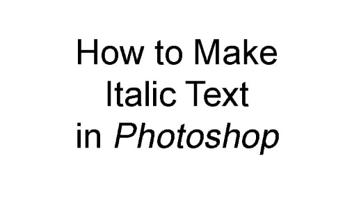
When you have finished your project, remember to switch off this italic setting as it stays on by default otherwise. However, much like the Faux Bold setting, you can also use Faux Italic in conjunction with the standard italic tool from the Upper Settings Bar to achieve an ultra-italic effect.
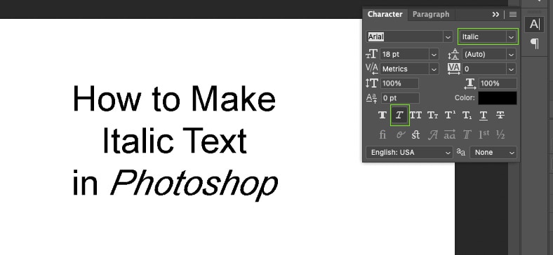
Although this combination of italic effects works, it produces a very over-the-top italic result which may not be suitable for most uses.
Now, if you’ve been stuck trying to learn how to work with text in Photoshop, be sure to check out my next guide on creating text in Photoshop. It breaks down absolutely everything you need to know when working with text in Photoshop and is the ultimate resource if you’ve ever felt stuck with the Type Tool.
Жирный шрифт в Фотошопе
Шрифты в Фотошопе – отдельная обширная тема для изучения. Программа позволяет создавать как отдельные надписи, так и целые блоки текста. Хотя Фотошоп и является графическим редактором, но шрифтам в нем уделено большое внимание.
Урок, который Вы сейчас читаете, посвящен тому, как сделать шрифт жирным.
Обратите внимание! Для того чтобы сделать шрифт жирным, совсем не обязательно использовать такую сложную, к тому же платную программу, как Photoshop. Это вполне можно сделать онлайн, воспользовавшись доступными в рамках веб-платформы Canva графическим редактором, в котором содержится множество инструментов для работы не только с текстом, но и с графикой.
Жирный шрифт в Фотошопе
Как известно, Фотошоп использует в своей работе системные шрифты, и все их свойства работают и в нем. Некоторые шрифты, к примеру, Arial, имеют в своем наборе знаки разной толщины. У данного шрифта это «Bold», «Bold Italic» и «Black».
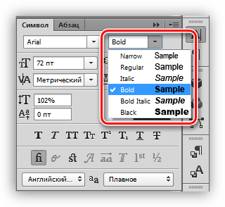
Вместе с тем, у некоторых шрифтов отсутствуют «жирные» глифы. Здесь на помощь приходит настройка шрифта под названием «Псевдополужирное». Странное слово, но именно данная настройка помогает сделать шрифт жирным, даже жирнее жирного.
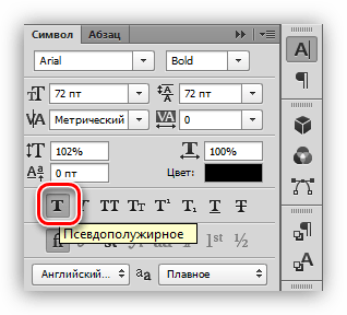
Правда, существуют ограничение на использование этого атрибута. К примеру, если Вы создаете дизайн сайта, то ни в коем случае не используйте «псевдо», только стандартные наборы «жирных» шрифтов.
Практика
Давайте создадим надпись в программе и сделаем ее жирной. При всей своей простоте, у данной операции существуют некоторые нюансы. Начнем с самого начала.
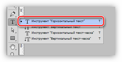
- Выбираем инструмент «Горизонтальный текст» на левой панели инструментов.
- Пишем необходимый текст. Слой создастся автоматически.
Обязательно произведите данную процедуру, без нее отредактировать шрифт через палитру настроек будет невозможно.
Таким образом, мы сделали самый жирный шрифт из набора Arial. Для других шрифтов настройки будут аналогичные.
Помните, что не всегда будет уместным применение жирного текста, но, если такая необходимость возникла, то информация, представленная в данном уроке, поможет Вам справиться с поставленной задачей.
Как сделать жирный шрифт в фотошопе?
Чтобы изменить размер всех символов в слое, выделите текстовый слой а панели «Слои». Выберите инструмент «Горизонтальный текст» или «Вертикальный текст» . На панели параметров введите или выберите новое значение размера. Можно указать размер шрифта более 72 пунктов.
Как в фотошопе сделать текст подчеркнутым?
Выделите текст, который надо подчеркнуть или перечеркнуть. Чтобы подчеркнуть горизонтальный текст, нажмите кнопку «Подчеркнутый» на панели «Символ».
Как выделить текст жирным шрифтом?
Для этого нажмите, соответственно, или . Если вы хотите применить курсивное начертание к уже имеющемуся тексту, выделите его, а затем нажмите или щелкните на кнопке Курсив.
Как писать жирным шрифтом в интернете?
Жирный текст: тег
Согласно спецификации HTML, тег b служит для выделения текста жирным шрифтом. В отличие от него, тег strong HTML служит для выделения важных фраз, слов, которые являются ключевыми для данной страницы.
Как увеличить любой объект в фотошоп?
Чтобы сделать это действие совсем простым, используйте горячие клавиши Ctrl + T, – по краям изображения появится выделение зоны, в пределах которой вы будете работать. Теперь вы можете изменять размер изображения.